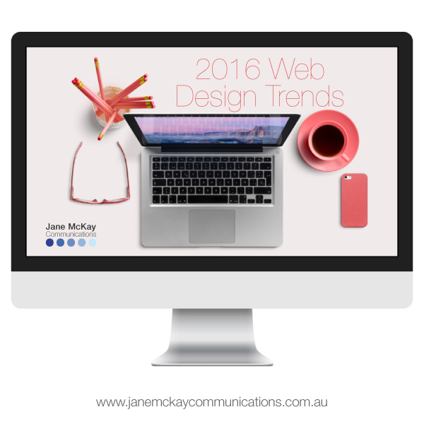
Top 10 web design trends for 2016 (and whether I'll be using them on my own site)

2016-web-design-trendsI'm currently re-designing my website which, in the flurry of activity over the last few years including (but not limited to) having a baby, undertaking massive projects, starting another business, volunteering at community events, etc. has been pushed back as a project for “when I have time”.

Designing and developing my new website has now become more of a necessity than a “nice to have” and so I embark on this huge task this week.

As a web designer, I spend a disproportionate amount of time looking at other people’s websites and saying “oooh”, “aaaah” and "shiny", so now the time has come to decide which of the top ten 2016 web design trends I will/will not integrate into my new site (which is coming soon, I promise - I mean it this time!).

  1. Responsive
    I don’t think this one can be called a “trend” any more, it’s a necessity! With more than 25% of browsing conducted on a phone or other device your site must be responsive, end of story. This is a no-brainer: IN! 
  1. Single page sites
    In some cases "single page sites" work amazingly; I know of some retail and product pages that work beautifully as single page, especially when the site takes you on a “journey” as you scroll. Don’t forget the “scroll to top” button! However if you require a lot of data from your Google Analytics, I'd avoid unless you have another tactic in place to capture data (there are some great plug-ins for us WordPress users). I’ll be including a lot of projects in my portfolio so a single page site simply won’t work for me. Here is a recent project that implements single page, and another.
  1. Parallax
    Parallax design is when you scroll but the image doesn't and it looks pretty cool. Although it’s been around for a while, it can be tricky to use unless you know how to minimise image size without sacrificing image quality. This is definitely an “in” on my new site where appropriate. 
  1. Video
    Video backgrounds look absolutely sensational in some instances but have a tendency to make me motion sick in others…. Not “in” for me at this stage but go for it if you have relevant videos to use.
  1. Full-screen backgrounds
    Full screen “hero” image backgrounds look amazing if you have beautiful, crisp, clear images. I am currently working on creating some beautiful images of my own to use on my site. Full screen backgrounds are definitely in for my new website.
  1. Minimal
    You know when you visit a website and it just feels… “nice”? It’s probably a minimally designed site. It doesn't have to be white and austere, pops of colour with simple typography give a fresh, clean feel to a site. I'm hoping to strike a good balance of "minimally content-rich" on my new site.
  1. Vertical menus
    As users become more experienced with the web, it’s given designers more leeway to be a bit braver with our navigation. In the “olden” days of web design everything had to be very clear about navigation. The user always had to know what to do and it had to be OBVIOUS! Now users are used to using the internet over multiple devices, we can trick things up a bit. Although I LOVE vertical menus, especially when paired with a great full screen background, I'm not 100% I’ll be using one on my new site…. Here is a recent project I completed that utilises a vertical menu beautifully.
  1. “Ghost” buttons
    I don’t want to clutter my beautiful full screen images with big, opaque buttons. Minimal, transparent buttons can be utilised to assist navigation without interfering with beautiful imagery. Definitely in for me.
  1. Sticky headers
    Another design element that’s come along as a consequence of responsive design is sticky headers or menus. Basically the menu stays “stuck” to the top of the screen no matter how far the user scrolls which, for mobile/tablet users is essential. Another in for me.
  1. Card layouts
    I'm blaming Windows 8 for this one (am I the only person who actually enjoys the Windows 8 UI?)! In the world of web design we are always trying to simplify the user’s experience so that they know where to go and what they need to do there at all times. Grid layouts based on square “cards” are clean, clear and work especially well for sites with a lot of images or require a gallery or portfolio. Definitely an in for me!


The most important branding question

Google autocomplete

I love meeting new small business owners. They're wrapped up in the excitement of their new business idea. It's thrilling, I know, I've been there (and am quite often "there" actually with all the ideas buzzing around in my head).

New business owners have grand plans for their fledgling business; they've registered an ABN and their business name and they come to me full of beans to get going on their logo, business stationery and website. I'm excited, they're excited. We go through the usual questions about colours, websites and USPs.

Then comes the question: How do your Google results look?

It's a question I ask all of my new branding clients. Most have a simple answer: great, I checked! And we move on.

For others, however, it's more complicated.

Either through a lack of research, a change in the business' reach or simply poor luck, I know of more than one small business who has had to undergo a complete re-brand due to stiff competition for Google rankings from big business. Be it for their name, an acronym or a "did you mean" result.

It can be absolutely crushing to start up a business and then realise the potential of the Google-disaster.

It's all very well to say it doesn't matter; I have a great business model and a fantastic product but let's face facts: it's 2015, without Google your website isn't going anywhere. Which is fine if you plan to operate solely off-line but that's going to seriously limit your business.

I assisted a client to undergo a re-brand when her business name was automatically switched to a "did you mean" result by Google bringing up an overseas competitor's business!

The client had researched local businesses in her area when she started her business but through her success her brand had gone global and now she was competing on a world stage. Her local business research was rendered moot: she was playing with the big guns and by big guns we mean BIG guns.

So what to do? Erode the brand loyalty she had already gained through her successful business and start again? Not entirely but the original brand was sacrificed for the sake of the Google result - her business simply couldn't operate without website traffic derived from Google search. It was as simple as that.

At the time this client had established a side business in the same sector but with a slightly different target audience; by funnelling her current audience to the "new" business before her "old" business reached the point of no return we salvaged what we could and moved on with the new brand. Obviously not ideal but it was picked up early and minimal damage was done (and the business is still thriving today, phew!).

Imagine if your business name (or the way it's represented by your logo or branding suite) was abbreviated to "BHP"? Sorry but no matter how good your SEO, as a small business you don't have a hope of competing against guns that big!

Another mistake is choosing a word, term or acronym that is commonly used in the English language. People are lazy, especially when Google does a lot of auto-completing on our behalf.

So, when you're thinking of branding (or re-branding) your business, here are five steps you need to take to avoid Google-related injuries:

  1. Do a simple Google search on your complete business name; i.e. Jane McKay Communications.
  2. Do a Google search on any abbreviations of your business name, i.e. JMC.
  3. Check Google auto-complete results for your business name by typing in the first few letters and seeing what is "suggested".
  4. Check misspellings of your business name in Google and see if your business name comes up as a "did you mean" result.
  5. Repeat steps 1 to 5 in Bing and Yahoo search.

Step 6? Do some keyword research while you're there!

If you're in the clear get excited! If not, don't despair, branding is meant to be fun! Start afresh. Enjoy the journey of building your new business.

Happy New Year!

Happy-New-YearHello you gorgeous people. Welcome to what will be a spectacular 2015!

Things are already busy for me and I hope they are in your business too.

Here at JMC HQ we (I use that term loosely) are in the midst of planning for what we hope will be our biggest year ever.

We'll celebrate six years in business in 2015 so I think we're due for a shake up! New projects, new strategies and new channels are all in my marketing mix. What's in yours? Do you have a defined marketing element in your strategic plan this year?

When I'm working on planning with my clients I naturally approach their business from the perspective of my business: marketing.

Always consider how to get the most mileage from any change, event, new product or announcement. Be that media (free or paid), website traffic, promotions or simply an email campaign. Flag each milestone in your strategic plan with a marketing idea.

Communication is at the heart of all marketing; this year take every opportunity to talk to your customers and clients.

Happy new year!

- Jane

Social media is hard. Don’t leave it to amateurs (or interns)

branding “I have a lot of work to do today,” I sighed to my husband this morning.

“What, like go on Facebook and Pinterest?” He retorted derisively, as if it were anything but work.

In marketing, anything that builds brand awareness and creates opportunities for exposure of your brand to potential customers is work. It doesn’t mean I don’t enjoy said work but it is work nonetheless.

It’s a tricky balance, in a solo gig, to strike to right balance between work and personality.

My work and my personality are so intertwined that sometimes I find it difficult to distinguish the two. My work is what I do and a huge part of who I am. That doesn’t mean that who I am needs to necessarily be expressed in my work.

Take Pinterest for example. I love Pinterest and have several Pinterest accounts for my personal and professional selves.

But just because I love Lolcats doesn’t mean I’ll be pinning them willy nilly to my Jane McKay Communications “Typography” Pinterest board (the font is Impact, for the record). Nor, because I am slightly obsessed with Typography does it mean humourous graphic design posts will go on my personal Pinterest page.

The rules of the Lolcats example apply to Facebook as well.

When you are creating posts for your business’ social media (or delegating to someone else) be clear about “who” your organisation is and always bear in mind what you post is an expression of your brand.

Your brand isn’t who you want to be, it’s how you are being perceived right now. Edit: Source Katya Andresen

While it’s tempting and easy to combine the personal and professional in your social media I know that my customers, followers and audience care not for my love of Lolcats; just as they care not what your intern may choose to randomly post on your Facebook page.

Social media’s perception as “fun” often diminishes the gravity with which it is regarded.

Stop and think: you have spent years building your brand and reputation. This can be undone in one misfired Tweet and, because of its viral nature, things can blow up very quickly. If you need an example, hark your mind back to the #McDStories campaign McDonald’s restaurants ran last year.

Wouldn’t want to be that social media manager, would you?

Think carefully about every post, pin and tweet and how that is perceived by your audience: is it enhancing your brand? Is it how you want your brand to be perceived? Is it on target for your brand? Is it attracting the right type of audience? Does it have the right tone? Is it on message?

It’s fine to be fun and add personality but always think about how your audience will receive that information and how they will perceive your brand as a result of receiving that information.

Social media managers, copywriters and marketing professionals are paid the (not so) big bucks because they are professionals with years of hard-earned education, training and experience behind them. They take the time to understand a brand and ensure that the messaging is on target, on brand and on message.

Don’t leave it to amateurs (or  interns).

Me Jane, I do marketing

I had an interesting encounter last week.

We have some lovely young ladies who have joined the organisation (at my "real" job in marketing, not my freelance work) as trainees. They were doing the tour and were shown into my office [read: cave] where the tour guide asked my position (he's new around here), "I do marketing," I replied.

-- I DO marketing? That's not even a proper sentence! I hear you grumble. Anyway, let's move on, shall we? --

I went on to say that if they had any questions about marketing then they can just ask. The girls (I can call them girls, they're 16 years old) shuffled their way further into my office, "Well, what is it that you actually do?"

Ah.... Well.... Marketing is a very broad topic to cover in 4 minutes but I attempted to explain my role in a few short(ish, for me) sentences.

"I make pretty pictures," was my self-deprecating start (7 years and thousands of dollars in uni fees summed up in one underwhelming sentence).

"Primarily I'm a copywriter, so I write. A lot. Every word in every ad you see has been written by a copywriter," (or should be) I say, flicking through our not-insubstantial Annual Report.

"Also I do PR, so I liaise with the media to get us free publicity." Anything vaguely joining us to the media probably sounds pretty glamourous to a 16 year old.

"Also I design," I say, gesturing to the print outs, colour forecasts, posters, pantone charts and paper samples littered around my cluttered office.

"And anything you see with one of our logos on it I have designed and sourced." The promo gear in my office was identified as an OH&S hazard in recent weeks, compelling me to clean up.

"In short, every article, advert, brochure, poster, flyer, invitation, promotional item, annual report, business card and letterhead comes through my office. I design and write every one."

I've realised that, stepping away from the big city corporate world, I had taken for granted that people know what marketing is and what us marketers do. I recall being aware of advertising when I was young but not realising that client-side marketing was a career option.

In a broad sense we manage everything to do with a brand's reputation; how it is perceived, published and promoted.

We are the protectors of the logos, the upholders of the fonts, the enforcers of the colours. We are the custodians of our brands.

You may not think you care about this sort of thing but we do, and that's our job. Although I bet you know when something doesn't look right or offends your eye.

So whenever you see a poorly-printed flyer, a misspelled advert or a skewed logo then you know that company's marketer hasn't been doing their job.

[As a side note, the manager of said trainees just came in to thank me for engaging the girls and said how it really sparked their interest which is apparently a challenge in adolescents.]

Colour me happy!

birth babe & beyond branding

birth babe & beyond branding

The colors of the web

It's not only fonts that rock my world it's colour! I just love how a bright pink scarf in the middle of winter can give me a lift, turquoise thongs (flip flops) make me yearn for summer and the green of my lawn brings me puppy-like joy.

Colour affects the perception of your brand by evoking emotion which is a crucial thing to consider when selecting corporate colours for your brand.

"Research reveals people make a subconscious judgment about a person, environment, or product within 90 seconds of initial viewing and that between 62% and 90% of that assessment is based on color alone." 

- Usabilitypost.com

I have had colours ruined for me by working in marketing departments, constant use of colour can be very fatiguing and in my current role I am limited to the corporate colours of burgundy, orange, grey and black (what a combo! No, I didn't choose them!).

Thankfully my freelance work allows me scope for playing with colour, especially as my a number of my clients have recently asked me to develop logos for their brands from scratch. It's a tricky business when working with clients as varied as photographers, doulas and now, a disability service.

Colours are as important as the words you use to convey your brand. Here's another great website on the importance of colour in branding.

I just drew this little logo for a friend of mine using some popular CMYK colours and integrating "Tangerine Tango" the Pantone Color of the Year which I adore. Originally the colours were too strong and required a bit of muting however working with this client we have come up with something she adores....