Top 10 web design trends for 2016 (and whether I'll be using them on my own site)

2016-web-design-trendsI'm currently re-designing my website which, in the flurry of activity over the last few years including (but not limited to) having a baby, undertaking massive projects, starting another business, volunteering at community events, etc. has been pushed back as a project for “when I have time”.

Designing and developing my new website has now become more of a necessity than a “nice to have” and so I embark on this huge task this week.

As a web designer, I spend a disproportionate amount of time looking at other people’s websites and saying “oooh”, “aaaah” and "shiny", so now the time has come to decide which of the top ten 2016 web design trends I will/will not integrate into my new site (which is coming soon, I promise - I mean it this time!).

  1. Responsive
    I don’t think this one can be called a “trend” any more, it’s a necessity! With more than 25% of browsing conducted on a phone or other device your site must be responsive, end of story. This is a no-brainer: IN! 
  1. Single page sites
    In some cases "single page sites" work amazingly; I know of some retail and product pages that work beautifully as single page, especially when the site takes you on a “journey” as you scroll. Don’t forget the “scroll to top” button! However if you require a lot of data from your Google Analytics, I'd avoid unless you have another tactic in place to capture data (there are some great plug-ins for us WordPress users). I’ll be including a lot of projects in my portfolio so a single page site simply won’t work for me. Here is a recent project that implements single page, and another.
  1. Parallax
    Parallax design is when you scroll but the image doesn't and it looks pretty cool. Although it’s been around for a while, it can be tricky to use unless you know how to minimise image size without sacrificing image quality. This is definitely an “in” on my new site where appropriate. 
  1. Video
    Video backgrounds look absolutely sensational in some instances but have a tendency to make me motion sick in others…. Not “in” for me at this stage but go for it if you have relevant videos to use.
  1. Full-screen backgrounds
    Full screen “hero” image backgrounds look amazing if you have beautiful, crisp, clear images. I am currently working on creating some beautiful images of my own to use on my site. Full screen backgrounds are definitely in for my new website.
  1. Minimal
    You know when you visit a website and it just feels… “nice”? It’s probably a minimally designed site. It doesn't have to be white and austere, pops of colour with simple typography give a fresh, clean feel to a site. I'm hoping to strike a good balance of "minimally content-rich" on my new site.
  1. Vertical menus
    As users become more experienced with the web, it’s given designers more leeway to be a bit braver with our navigation. In the “olden” days of web design everything had to be very clear about navigation. The user always had to know what to do and it had to be OBVIOUS! Now users are used to using the internet over multiple devices, we can trick things up a bit. Although I LOVE vertical menus, especially when paired with a great full screen background, I'm not 100% I’ll be using one on my new site…. Here is a recent project I completed that utilises a vertical menu beautifully.
  1. “Ghost” buttons
    I don’t want to clutter my beautiful full screen images with big, opaque buttons. Minimal, transparent buttons can be utilised to assist navigation without interfering with beautiful imagery. Definitely in for me.
  1. Sticky headers
    Another design element that’s come along as a consequence of responsive design is sticky headers or menus. Basically the menu stays “stuck” to the top of the screen no matter how far the user scrolls which, for mobile/tablet users is essential. Another in for me.
  1. Card layouts
    I'm blaming Windows 8 for this one (am I the only person who actually enjoys the Windows 8 UI?)! In the world of web design we are always trying to simplify the user’s experience so that they know where to go and what they need to do there at all times. Grid layouts based on square “cards” are clean, clear and work especially well for sites with a lot of images or require a gallery or portfolio. Definitely an in for me!


The most important branding question

Google autocomplete

I love meeting new small business owners. They're wrapped up in the excitement of their new business idea. It's thrilling, I know, I've been there (and am quite often "there" actually with all the ideas buzzing around in my head).

New business owners have grand plans for their fledgling business; they've registered an ABN and their business name and they come to me full of beans to get going on their logo, business stationery and website. I'm excited, they're excited. We go through the usual questions about colours, websites and USPs.

Then comes the question: How do your Google results look?

It's a question I ask all of my new branding clients. Most have a simple answer: great, I checked! And we move on.

For others, however, it's more complicated.

Either through a lack of research, a change in the business' reach or simply poor luck, I know of more than one small business who has had to undergo a complete re-brand due to stiff competition for Google rankings from big business. Be it for their name, an acronym or a "did you mean" result.

It can be absolutely crushing to start up a business and then realise the potential of the Google-disaster.

It's all very well to say it doesn't matter; I have a great business model and a fantastic product but let's face facts: it's 2015, without Google your website isn't going anywhere. Which is fine if you plan to operate solely off-line but that's going to seriously limit your business.

I assisted a client to undergo a re-brand when her business name was automatically switched to a "did you mean" result by Google bringing up an overseas competitor's business!

The client had researched local businesses in her area when she started her business but through her success her brand had gone global and now she was competing on a world stage. Her local business research was rendered moot: she was playing with the big guns and by big guns we mean BIG guns.

So what to do? Erode the brand loyalty she had already gained through her successful business and start again? Not entirely but the original brand was sacrificed for the sake of the Google result - her business simply couldn't operate without website traffic derived from Google search. It was as simple as that.

At the time this client had established a side business in the same sector but with a slightly different target audience; by funnelling her current audience to the "new" business before her "old" business reached the point of no return we salvaged what we could and moved on with the new brand. Obviously not ideal but it was picked up early and minimal damage was done (and the business is still thriving today, phew!).

Imagine if your business name (or the way it's represented by your logo or branding suite) was abbreviated to "BHP"? Sorry but no matter how good your SEO, as a small business you don't have a hope of competing against guns that big!

Another mistake is choosing a word, term or acronym that is commonly used in the English language. People are lazy, especially when Google does a lot of auto-completing on our behalf.

So, when you're thinking of branding (or re-branding) your business, here are five steps you need to take to avoid Google-related injuries:

  1. Do a simple Google search on your complete business name; i.e. Jane McKay Communications.
  2. Do a Google search on any abbreviations of your business name, i.e. JMC.
  3. Check Google auto-complete results for your business name by typing in the first few letters and seeing what is "suggested".
  4. Check misspellings of your business name in Google and see if your business name comes up as a "did you mean" result.
  5. Repeat steps 1 to 5 in Bing and Yahoo search.

Step 6? Do some keyword research while you're there!

If you're in the clear get excited! If not, don't despair, branding is meant to be fun! Start afresh. Enjoy the journey of building your new business.

Top Marketing Trends for 2014

Color-of-the-yearI spend a large amount of my time indulging my inner geek and examining, pondering and questioning the latest marketing, web, search, design and social media trends.

So here you have my top 14 marketing trends for 2014.

Marketing

  1. Good customer service is, and always will be, your most powerful marketing tool

Word of mouth still remains the most powerful influencer on purchasing decisions made by consumers; be that in person or via the internet, social media or even your local media.

Customer service that goes above and beyond (or is even just plain old basic “good” these days) speaks volumes for your organisation.

  1. Content marketing

What’s content marketing I hear you ask? At its core, content marketing is creating content that users want or need. It’s not shoving a flyer under their windscreen wiper or spamming their inbox, it’s creating a blog post, an image or a video that users actually want, that they will enjoy and, most importantly, share.

Content marketing has its origins in the need of the customer, it’s about attracting customers, not paying to reach them.

  1. Video

Despite what you’re thinking, video is cheap and easy to do and it can add another dimension to your content marketing efforts. Video marketing builds brand personality, improves customer engagement and boosts your search engine ranking.

With as little as the camera on your mobile phone you can create, edit and share a video. It doesn’t have to be slick but it does have to be informative.

Video ideas include information highlighting the features and benefits of your latest product, webinars and simple how-tos. With the focus on content and the enhancements of Google’s latest update, videos are amazingly searchable content.

Want to see some of the most successful video marketing? Go to Blendtec’s channel on YouTube.

  1. Value never goes out of style

Give your customers something in your marketing and I don’t just mean a groovy promotional item.

Whether it’s an informative “how-to” demonstration, a step-by-step tutorial or simply beautiful images that bring people joy; for your audience to be engaged with your brand, they need to perceive value in your marketing offerings. It’s the notion of “what’s in it for me” (WIIFM) marketing.

Web

  1. Responsive design is the only way

Responsive web design is basically optimising your website to be viewed on all manner of devices and screen sizes: smartphones, tablets, etc.

If your website isn’t responsive, you’re annoying a quarter of your target audience as, globally, 19.1% of all global web usage is now done using a mobile phone while tablet usage is 4.8% and on the rise. Smartphone penetration reached 65 percent in 2013, up from 44 percent in 2011 and is expected to continue climbing in 2014; some analysts predict that reach could be as high as 75 percent by the end of the year.

  1. Flash is dead, people

Sorry but Steve Jobs killed it.

If you’re not into web development you would still “know” Flash developed sites if you saw them, they were those jaw-droppingly beautiful sites created in the early-mid noughties that had animated home pages and other visual trickery. I loved Flash, I thought it was stunning but also annoying and invasive as it interfered with the native digital experience.

Basically, they’re the reason the “Skip Intro” button was invented.

When Apple made the decision to ship its iPhones without Flash Player in 2010 it sounded the death knell for Flash.

In this world where search engine rankings are critical to getting your business seen Flash is a massive no-no as Flash content cannot be crawled i.e. “seen” by search engine bots.

If your site is Flash-based, you really should look at redeveloping it. Now!

  1. Visual is king

Sites with crazy mixed-up fonts, mish-mashed, non-intuitive layouts and skewed images  make users (especially me) cranky. With larger screens and HTML5, web developers everywhere are developing more and more beautiful sites and if your site isn’t beautiful, your designer isn’t trying hard enough.

Now we’re all a bit more familiar with the interwebs, users are coming to expect stunningly-designed websites.

While it’s not always relevant to create an amazingly-visual site for every brand, it can still be attractive. If you don’t like your site, talk to a designer (and not your friend’s boyfriend who builds sites as a side gig) but an actual website designer.

This doesn’t just apply to websites but all media; advertising, packaging, apps, etc.

Media

  1. Google+

We resisted, we really did, but as a social network Google+ is simply too important to ignore.

With the added search benefits of being attached to Google, many people will be making the move from Facebook to G+ over the coming years and no doubt members of your target audience will be amongst those making the migration. This ship is sailing very soon so get on board.

  1. Paid organic social amplification or “you have to pay to play”

I often cite the statistic of Facebook posts having a reach of 17% to clients embarking on the social media journey. Recently however the team at Ignite Social Media found reach could be as low as 2.5%. Ouch!

Admittedly I have noticed my Facebook site stats have been taking a hammering lately and have been wondering whether it’s actually worth my time and it seems that to make headway as a brand on all social networks, this year marketers are going to have to cough up on these previously “free” networks.

I still think it’s valuable to have a Facebook presence but you have to put in more effort to get noticed if you’re not prepared to pay for advertising.

  1. Niche media

Looking for a place to call your own and where you feel at home with like-minded individuals on the internet? Niche social sites have the answer. Whether you’re into music, are of a “senior” age, love books, design, sewing, zombies or cats, there is a niche social network for you!

What does this mean for marketers? Cheaper, more targeted advertising than larger, generic social media networks (see point 9). No matter what your business does, there’s more than likely a relevant niche social network out there.

Search

  1. Deep, fresh content

The latest Google Hummingbird update means that semantic search as opposed to keyword search is the in thing right now. Search engines can now grasp the meaning of a search query in context, i.e. users can search “how does a cake rise”, “what makes a cake rise”, etc.

Keywords used to be the only focus for websites, leaving us copywriters very frustrated by having to focus on keyword density that yielded poor-quality content just to up Google rankings.

Google have designed their last three updates, Panda, Penguin and Hummingbird to stamp out SEO techniques that resulted in poor quality content climbing the ranks.

While I could go into the technicalities but I won’t, basically this opens up the web content space dramatically especially to those of us who love to write (or pay someone who does)!

Longer, more detailed and enriched content is the answer to this so get your content planning hat on!

  1. Online audience optimization (OAO)

If there’s one thing us marketers love it’s a jargonistic acronym.

OAO is the new SEO. It’s is already here and happening!

OAO is basically creating content with the user in mind instead of just search engine rankings. Sounds basic enough? Create high quality, more detailed, enriched content and you’re on your way (see point 11).

Design

  1. Celebrate colour

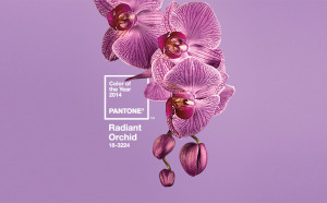
In case you missed it Radiant Orchid is the Pantone Colour of the Year. What does this mean for you?

Do you recall that scene in “The Devil Wears Prada” where Miranda (played by Meryl Streep) dresses down Andy (played by Anne Hathaway) for not appreciating that her sweater is cerulean (you can read the transcript here)? Well, that’s the importance of the Colour of the Year.

Pantone are the authority on colour and if they say a colour is hot, then it’s hot.

Expect to see a lot more purple across all design in 2014; fashion, interiors, websites, logos, etc.

Other colours that I’m picking to trend (if they aren’t already)? Navy (although Pantone selected Dazzling Blue as part of the Spring colour palette I think navy is easier to use), yellow, grey and lime green.

Ultra brights will be huge too, not fluoros which have been trending in recent years but big, bright, bold colours.

  1. Halftones

Not familiar with half tone? Think Andy Warhol, Pop Art-esque dot images or old school newspaper images that were printed with dots.

I saw a fair amount of half tone design in 2013 and expect it to a lot more of it in 2014 along with any designs that sees cyan, magenta, yellow and key (black) (CMYK) layered to dramatic effect. While we’re talking retro, expect to see a lot more geometric design to go along with the half tones.

Well, they’re my top marketing trends for 2014! What are your favourite predicted and emerging marketing trends for 2014?

Migrating from WordPress.com to WordPress.org with surprising results

codeispoetry-rgbWow! I must say, I’m impressed.

I’d put off migrating my blog from WordPress.com to my self-hosted site as I was concerned traffic would drop as a result of not being directly connected to the WordPress community.

The time had come, so I migrated on Friday. I published one post yesterday (Tuesday) and have already eclipsed the best-ever traffic day I had on WordPress.com.

So there you go, you think you’re taking a risk and it turns out to be a much better option for your business!

It’s taken a long time and a lot of (wo)man hours but it’s done and I’m happy with the result. It still needs tweaking but I’d rather have it out there than not.

So what steps did I take to migrate my blog from WordPress.com to WordPress.org?

  1. I found a decent, local host that allows a one-click WordPress install. One-click is a lot easier than trying to set up a testing site on your desktop (take it from me, I tried and failed at the mySQL database privilegesstage).
  2. I set up a “testing” sub-domain via cPanel and installed WordPress there, the equivalent of a sandbox environment where I could “play” with my new site.
  3. I built my (responsive) site. There were a few hiccups along the way, including being hacked and having to start from scratch! But here it is, using WordPress as a CMS. I know a lot more now than I ever thought I would about the mysterious workings of WordPress. Happily I know code and was able to customise the visual to my liking.
  4. I exported my old blog from WordPress.com to my WordPress.org (self-hosted) site following the instructions here. I was tempted to purchase a “guided” transfer but the transfer staff “weren’t there that day” according to the message. Was I up for the challenge? Why yes, yes I was and it was easier than I had
  5. I purchased a re-direct from WordPress.com for USD$13 for 12 months. Invaluable, in my mind, as anyone who has bookmarked your blog will still be able to find you.
  6. I installed “Velvet Blues Update URLs” plug in which updates all your internal links to point to the posts within your new site.
  7. I migrated my testing site to my main domain and, like magic, the JMC website had a major transformation from the old, image-based, non-SEOed one I whipped up one evening and was meant to be temporary, to a slicker, more visual site which is a breeze to update.


Things to remember:


I’ll update this post if I remember any other key points in my “journey”.

Is there any helpful advice you can provide to the bloggers about to go out on there own? Please add it below.