
 I'm currently re-designing my website which, in the flurry of activity over the last few years including (but not limited to) having a baby, undertaking massive projects, starting another business, volunteering at community events, etc. has been pushed back as a project for “when I have time”.
Designing and developing my new website has now become more of a necessity than a “nice to have” and so I embark on this huge task this week.
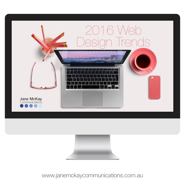
As a web designer, I spend a disproportionate amount of time looking at other people’s websites and saying “oooh”, “aaaah” and "shiny", so now the time has come to decide which of the top ten 2016 web design trends I will/will not integrate into my new site (which is coming soon, I promise - I mean it this time!).
- Responsive
I don’t think this one can be called a “trend” any more, it’s a necessity! With more than 25% of browsing conducted on a phone or other device your site must be responsive, end of story. This is a no-brainer: IN!
- Single page sites
In some cases "single page sites" work amazingly; I know of some retail and product pages that work beautifully as single page, especially when the site takes you on a “journey” as you scroll. Don’t forget the “scroll to top” button! However if you require a lot of data from your Google Analytics, I'd avoid unless you have another tactic in place to capture data (there are some great plug-ins for us WordPress users). I’ll be including a lot of projects in my portfolio so a single page site simply won’t work for me. Here is a recent project that implements single page, and another.
- Parallax
Parallax design is when you scroll but the image doesn't and it looks pretty cool. Although it’s been around for a while, it can be tricky to use unless you know how to minimise image size without sacrificing image quality. This is definitely an “in” on my new site where appropriate.
- Video
Video backgrounds look absolutely sensational in some instances but have a tendency to make me motion sick in others…. Not “in” for me at this stage but go for it if you have relevant videos to use.
- Full-screen backgrounds
Full screen “hero” image backgrounds look amazing if you have beautiful, crisp, clear images. I am currently working on creating some beautiful images of my own to use on my site. Full screen backgrounds are definitely in for my new website.
- Minimal
You know when you visit a website and it just feels… “nice”? It’s probably a minimally designed site. It doesn't have to be white and austere, pops of colour with simple typography give a fresh, clean feel to a site. I'm hoping to strike a good balance of "minimally content-rich" on my new site.
- Vertical menus
As users become more experienced with the web, it’s given designers more leeway to be a bit braver with our navigation. In the “olden” days of web design everything had to be very clear about navigation. The user always had to know what to do and it had to be OBVIOUS! Now users are used to using the internet over multiple devices, we can trick things up a bit. Although I LOVE vertical menus, especially when paired with a great full screen background, I'm not 100% I’ll be using one on my new site…. Here is a recent project I completed that utilises a vertical menu beautifully.
- “Ghost” buttons
I don’t want to clutter my beautiful full screen images with big, opaque buttons. Minimal, transparent buttons can be utilised to assist navigation without interfering with beautiful imagery. Definitely in for me.
- Sticky headers
Another design element that’s come along as a consequence of responsive design is sticky headers or menus. Basically the menu stays “stuck” to the top of the screen no matter how far the user scrolls which, for mobile/tablet users is essential. Another in for me.
- Card layouts
I'm blaming Windows 8 for this one (am I the only person who actually enjoys the Windows 8 UI?)! In the world of web design we are always trying to simplify the user’s experience so that they know where to go and what they need to do there at all times. Grid layouts based on square “cards” are clean, clear and work especially well for sites with a lot of images or require a gallery or portfolio. Definitely an in for me!