
birth babe & beyond branding
It's not only fonts that rock my world it's colour! I just love how a bright pink scarf in the middle of winter can give me a lift, turquoise thongs (flip flops) make me yearn for summer and the green of my lawn brings me puppy-like joy.
Colour affects the perception of your brand by evoking emotion which is a crucial thing to consider when selecting corporate colours for your brand.
"Research reveals people make a subconscious judgment about a person, environment, or product within 90 seconds of initial viewing and that between 62% and 90% of that assessment is based on color alone."
- Usabilitypost.com
I have had colours ruined for me by working in marketing departments, constant use of colour can be very fatiguing and in my current role I am limited to the corporate colours of burgundy, orange, grey and black (what a combo! No, I didn't choose them!).
Thankfully my freelance work allows me scope for playing with colour, especially as my a number of my clients have recently asked me to develop logos for their brands from scratch. It's a tricky business when working with clients as varied as photographers, doulas and now, a disability service.
Colours are as important as the words you use to convey your brand. Here's another great website on the importance of colour in branding.
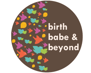
I just drew this little logo for a friend of mine using some popular CMYK colours and integrating "Tangerine Tango" the Pantone Color of the Year which I adore. Originally the colours were too strong and required a bit of muting however working with this client we have come up with something she adores....